The Psychology of Color in Trade Show Booth Design
Before an attendee reads a single word on a banner, before they register a brand name or recognize a logo, they have already processed the colors of the booth. It happens in a fraction of a second and it happens subconsciously — a gut reaction that determines whether the space feels inviting or forgettable, energetic or sterile, trustworthy or overwhelming. On a trade show floor where hundreds of exhibits compete for attention within the same crowded hall, color is often the first and fastest differentiator a brand has.
This is why color psychology trade show strategy matters. It is not just about choosing colors that look good. It is about understanding how color influences perception, shapes emotional responses, and drives behavior in a high-stimulus environment. The brands that approach color intentionally — as a strategic design tool rather than a purely aesthetic choice — consistently outperform those that treat it as an afterthought. Beaver XP brings this level of intentionality to every exhibit, designing spaces where color works as hard as every other element in the booth.
How Color Influences First Impressions on the Show Floor
The human brain processes color before it processes text, shapes, or spatial relationships. Research in visual perception has shown that people form initial judgments about an environment within milliseconds, and color accounts for a significant portion of that impression. In a trade show setting, where attendees are scanning dozens of booths in rapid succession, this has enormous implications.
A booth with a bold, confident color palette signals energy and presence. A booth with muted, sophisticated tones suggests authority and refinement. A booth with chaotic or clashing colors creates visual noise that the brain instinctively avoids. These reactions are not conscious decisions — they are hardwired responses that influence whether someone slows down or keeps walking.
What makes this particularly important in a trade show environment is the density of competing visuals. Unlike a retail store or a website, where a brand controls the entire visual landscape, a trade show booth exists within a sea of other exhibits, each projecting its own palette, lighting, and energy. The colors a brand chooses do not exist in isolation — they interact with everything around them. A booth that looks striking in a rendering can feel completely different when it is surrounded by neighboring exhibits in similar tones. Understanding this context is part of effective color strategy.
What Different Colors Communicate in an Exhibit Setting
Every color carries a set of psychological associations that influence how people feel when they encounter it. These associations are not absolute — they shift based on culture, industry, and context — but they provide a useful framework for strategic design decisions.
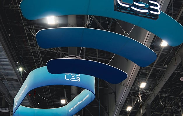
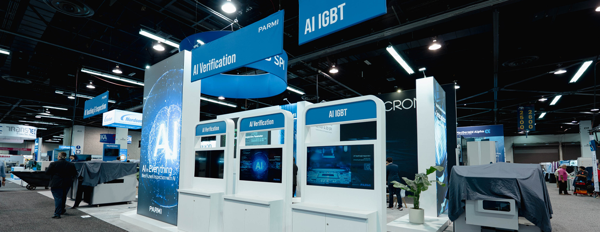
Blue is one of the most commonly used colors in trade show exhibits, and for good reason. It communicates trust, reliability, and professionalism. Technology companies, financial institutions, and healthcare brands frequently lean on blue because it creates a sense of calm authority. Red, on the other end of the spectrum, conveys urgency, energy, and passion. It grabs attention quickly and is often used as an accent color to highlight calls to action or draw the eye toward specific areas of the booth.
Green signals growth, sustainability, and balance. It resonates strongly with brands in the environmental, health, and wellness spaces. Black projects luxury, sophistication, and power — it is a popular choice for premium brands that want to create a high-end feel. Orange and yellow communicate warmth, creativity, and approachability, making them effective choices for brands that want to feel accessible and energetic. White creates a sense of openness, cleanliness, and simplicity, and is frequently used as a foundational color that allows other design elements to stand out.
The important thing to remember is that these associations are starting points, not rules. The way a color is applied — its saturation, contrast, proportion, and pairing — matters just as much as the color itself. A soft navy blue tells a different story than a bright electric blue, even though both fall within the same color family.
Aligning Booth Color Strategy With Brand Identity
One of the most common tensions in trade show design is the balance between leveraging color psychology and staying true to an established brand identity. Most brands arrive at the exhibit design process with an existing color palette — defined by brand guidelines, used across marketing materials, and familiar to their audience. The question is how to use those colors strategically within the booth environment without abandoning the brand’s visual identity.
The answer usually lies in emphasis and proportion. A brand does not need to change its colors to apply color psychology — it needs to think about how those colors are deployed within the space. If the primary brand color is a deep blue, the booth can use that blue as the dominant tone while introducing warmer accent colors in specific zones to create energy and draw attention. If the brand palette is primarily neutral, strategic use of a single bold accent color can create focal points without overwhelming the visual identity.
Beaver XP works with brands to find this balance — using color as a design lever that amplifies the brand’s personality rather than competing with it. The goal is not to redesign the brand for the trade show floor. It is to optimize how the brand’s existing visual language performs in a high-stimulus environment where attention is the most valuable currency.
Using Color to Guide Attention and Movement Within the Booth
Beyond first impressions and emotional associations, color serves a powerful functional role inside the booth. It can act as an invisible wayfinding system, guiding attendees through the space and drawing their attention toward the areas that matter most.
Color contrast is the primary tool here. A product display set against a contrasting background naturally pulls the eye. A demo station framed in a bold accent color stands out from the surrounding structure and signals that something important is happening there. Meeting areas rendered in warmer, softer tones create a sense of comfort that encourages longer conversations. These are not arbitrary design choices — they are intentional applications of color that shape how people move through and interact with the booth.
Color blocking is another effective technique. Using distinct color zones within the booth creates a visual rhythm that breaks the space into digestible sections. Rather than one uniform wall of color, a booth with defined zones — each marked by a different tone or shade — gives attendees visual cues about where to go and what to expect. It creates a sense of journey within the exhibit, even in a relatively compact footprint.
Gradients and transitional tones can also serve a guiding function. A gradual shift from one color to another across a surface creates a sense of direction and flow, subtly encouraging movement and preventing the booth from feeling static.
Common Color Mistakes in Trade Show Booth Design
Even well-intentioned color strategies can fall flat when certain pitfalls are not accounted for. One of the most frequent mistakes is using too many colors at once. When a booth tries to incorporate five or six competing tones, the result is visual chaos that overwhelms the eye and dilutes the brand message. A focused palette — typically two to three core colors with one or two accents — almost always performs better than a broad one.
Another common error is choosing colors based on how they look on screen without considering how they will appear under expo hall lighting. Convention center lighting is harsh and tends to wash out certain tones while intensifying others. Colors that look vibrant in a rendering can appear flat in person. Testing colors under realistic lighting conditions — or building custom lighting into the booth — prevents this disconnect.
Failing to consider the competitive landscape is another missed opportunity. If a brand’s booth is deep blue and it ends up positioned next to three other blue booths, the differentiation advantage disappears. Experienced exhibitors research the show floor map and consider what their neighbors might look like before finalizing their palette.
Color is one of the most powerful tools in trade show booth design, and it is one of the most underestimated. When applied with intention and strategy, it shapes how attendees feel, where they look, and how they move through the space. It influences perception before a single conversation begins and reinforces brand identity long after the show ends. Reach out to Beaver XP to start designing an exhibit where every color choice works as hard as every other element on the floor.